Type
TV Design
Duration
1 Month
Team
Sofía López, Laura Amador
Tools
Figma, Figjam
Summary
As part of my UX/UI Postgraduate final project, Laura Amador and I redesigned the Amazon Fire TV platform to enhance the search and recommendation engine capabilities. Through extensive research, including surveys and interviews, we identified common challenges and user frustrations. We developed a user persona named Joan and created a solution called Friends TV, which allows users to connect with friends, check out and save their movie lists, and receive personalized recommendations. We also conducted a competitive analysis and created wireframes and high-fidelity designs. The project highlighted the importance of designing for TV screens and considering factors such as viewing distance and navigation simplicity.
Project Overview
For the ones who don’t know, Fire TV is a streaming device that plugs into your TV and gives you access to a variety of streaming services, including Netflix, Hulu, Disney+, Max and Amazon Prime Video.
Our project focused on enhancing their platform through the implementation of a new feature designed to elevate the search and recommendation engine capabilities.
Redefining Home Entretainment
Process
Our project was primarily focused on the discovery phase, we needed to thoroughly understand the challenges of the platform.
We needed to conduct extensive research, despite being unfamiliar with the platform and lacking contacts who had used it before. Fortunately, the university provided us with unrestricted access to Fire TV on campus. We took advantage of this opportunity to familiarize ourselves with it through hands-on experimentation. However, we faced another challenge when we were not given any user information. To address this, we reached out to our network and were fortunate to find several willing users who agreed to take part in our research.

Research Insights
Research Plan
Find out the user point of view, their frustrations and their struggle to get their understanding.
Survey
Our research began with a brief survey aimed at identifying common product challenges and understanding user flow issues.
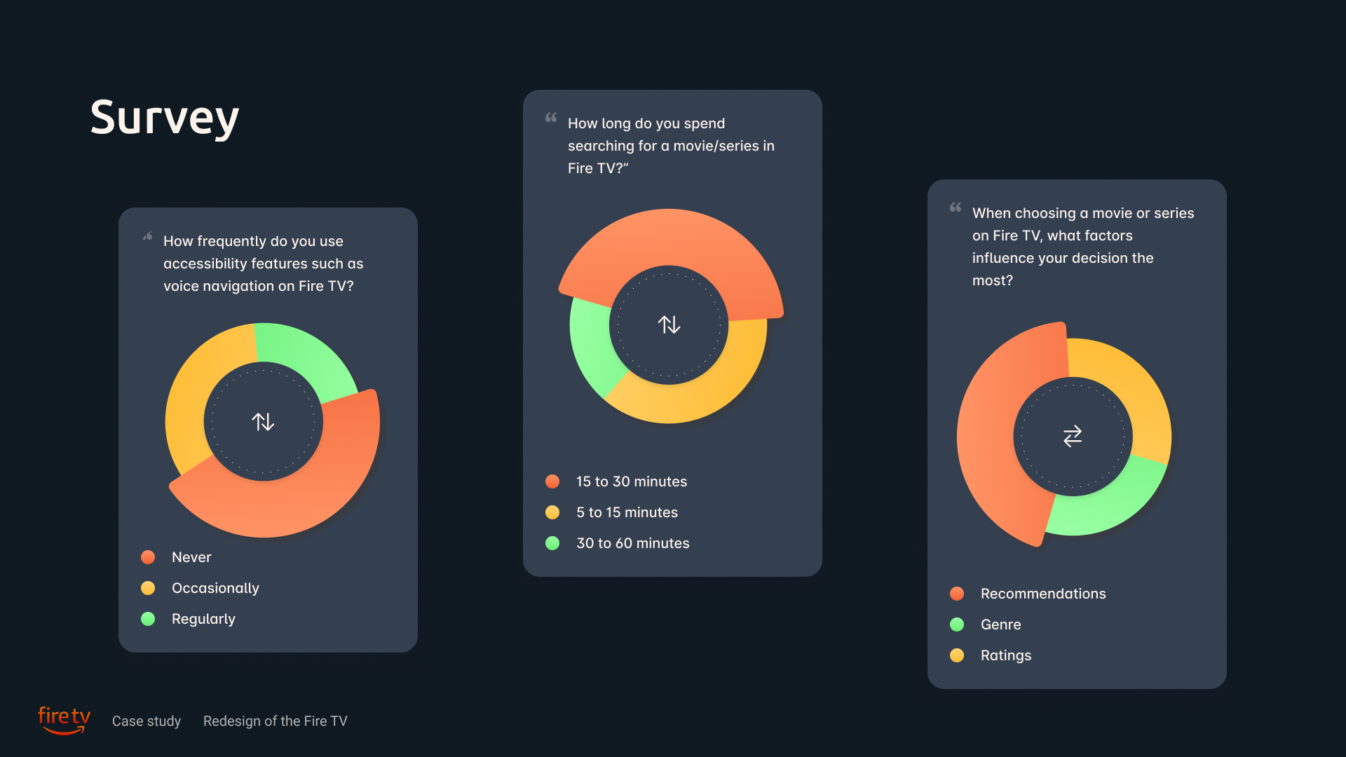
We used Instagram stories to reach out to our network and widely distribute the survey (the target audience were between the age 20-50 years old). Here are several key findings from our outreach:
-
40% have never used accessibility features such as voice navigation.
-
An impressive 80% users spend more than 15 minutes to find a movie/serie to watch.
-
For 70% feel overwhelmed by the variety of options in the app; setting this as the major obstacle.
-
When choosing a movie, the factors most frequently mentioned were recommendations, genre, and ratings.
Interviews
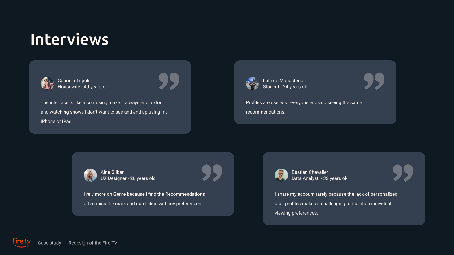
We selected 4 individuals for direct interviews to gain deeper insights and detailed information essential for our project. Gathering these detailed insights relied heavily on conducting user interviews.
Define the Problem
Define The User Persona
Based on our comprehensive research, we developed our user persona. Meet Joan — a 25 years old, Marketing Luxury Specialist. Joan aims to swiftly discover and enjoy personalized content, seamlessly integrating friends‘ recommendations into his dynamic and socially active lifestyle through his streaming platform.
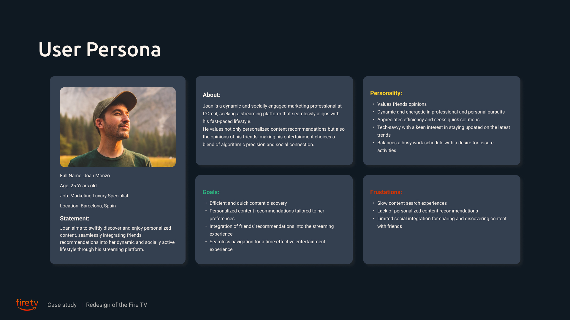
Joan is a dynamic and socially engaged marketing professional at L’Oréal, seeking a streaming platform that seamlessly aligns with his fast-paced lifestyle.
He values not only personalized content recommendations but also the opinions of his friends, making his entertainment choices a blend of algorithmic precision and social connection.
Joan’s Frustrations
-
Slow content search experiences.
-
Lack of personalized content recommendations.
-
Limited social integration for sharing and discovering content with friends.
Joan’s Goals
-
Efficient and quick content recommendations.
-
Personalized content recommendations tailored to his preferences
-
Integration of friend’s recommendations into the streaming experience
-
Seamless navigation for a time-effective entertainment experience
Heuristic Research
We began by conducting a through analysis of the Fire TV’s current search flow, examining its existing features, user interface, and identifying potential pain points in the user experience.
This initial exploration was crucial to maintain unbiased conclusions before proceeding with further research.

Competitive Analysis
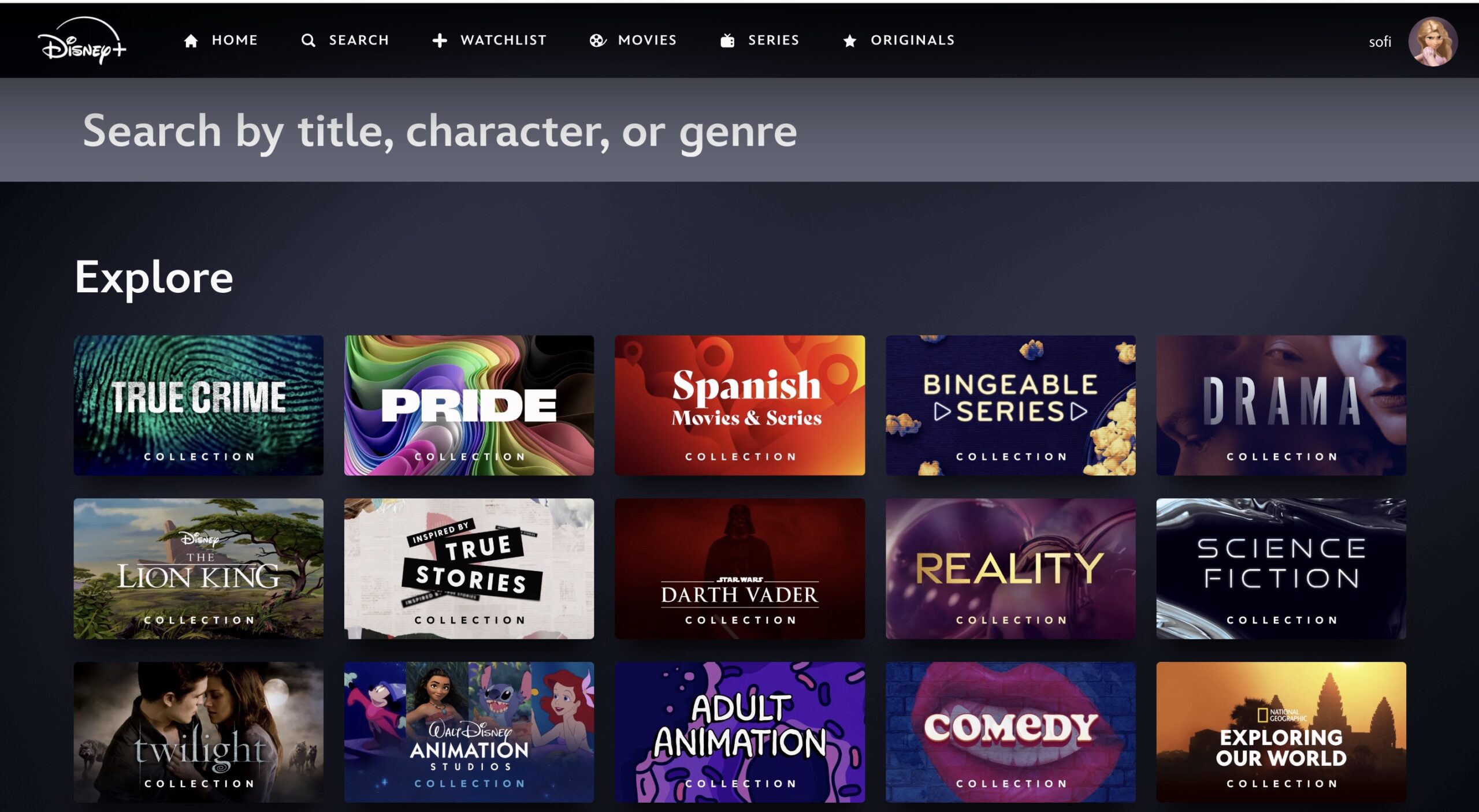
We also gather more information by checking other streaming platforms and analyzing their best features for inspiration.
I’m not going to include the whole extensive competitive analysis, but just share some of the biggest insights.

The dual-step screening enhances spatial orientation and prevents user disorientation effectively. (Max)
Problem Statement
Lost in the Streaming Jungle
Users frequently encounter challenges due to the overwhelming amount of content available on digital platforms, which complicates the process of finding desired content and often leads to prolonged search times, potentially resulting in frustration and a tendency to resort to instant gratification options like social media.
Creating the Solution
The primary goal is to enhance its user experience functions, prioritizing intuitive navigation and visually appealing design.
-
Finding personalized content that truly suits you, quickly
-
Provide a unique functionality
-
Overall: consistent, accessible and social
Building a Community
Let me paint a familiar picture for you:
You’ve had a long day, you finally sink into your couch, and the question arises: “What can I watch today?” You begin your quest on your favorite streaming platform, browsing through recommendations, top 10 lists, and various genres. Before you know it, 30 minutes have slipped away, and it’s too late to start anything. Frustrated, you settle for some reels and call it a night.
Now, think about this. We are inherently social beings, thriving on the relationships we cultivate. We trust our friends and family implicitly—sometimes they know us better than we know ourselves. How often have you asked, “Was that movie any good?” only to have your best friend say, “No, it was terrible, but you’ll love it because you enjoy quirky films”? Ultimately, it’s our close-knit community that can recommend content tailored to our tastes the best.
That’s why we’ve introduced Friends TV.

Friends TV lets you connect with your friends, check out and save their movie lists , and enhances your viewing experience in a way that’s both personal and engaging. When you finish watching a movie or episode, you’re prompted to react to it—expressing your emotions and rating it. But it doesn’t stop there. You’re also asked to recommend the movie to friends who might enjoy it. This feature refines the algorithm, ensuring that when you search for a movie, you not only see your friends’ reactions but also get recommendations that are truly personalized.


With Friends TV, we’re bringing the human touch back into your streaming experience. It’s about making your search faster, your choices easier, and your viewing time truly enjoyable. So next time you wonder, “What should I watch?” let Friends TV guide you with the insights and recommendations from those who know you best.
Arquitecture
We streamlined the user flow to improve efficiency, accessibility, and user satisfaction, integrating concepts such as intuitive navigation, and user-centric design principles.

Ideation
In our wireframing process, we began by employing the Crazy 8 method, a structured ideation technique where we rapidly sketched eight different variations of screens within a short timeframe. This approach allowed us to explore a diverse range of design ideas quickly and efficiently.
Following the Crazy 8 session, we applied the MoSCoW method for prioritization and decision-making. MoSCoW stands for Must have, Should have, Could have, and Won’t have right now. This method helped us categorize and evaluate each wireframe based on its importance and feasibility in meeting project objectives and user requirements.
By leveraging these systematic approaches, we were able to not only generate a comprehensive set of wireframes but also strategically prioritize and refine designs that best addressed both functional necessities and user preferences.
Mid Fidelity

Style Guide
Now it was time to focus on designing the interface for the feature within Amazon’s robust design system. While Amazon has a comprehensive Design System in place, some elements required adjustments to enhance readability and ensure consistency within Amazon’s established framework.
To guide our high-fidelity screen designs, we developed a style tile using Amazon’s existing state and background color palette. We enhanced the primary color with a gradient to attract more attention and encourage user interaction.

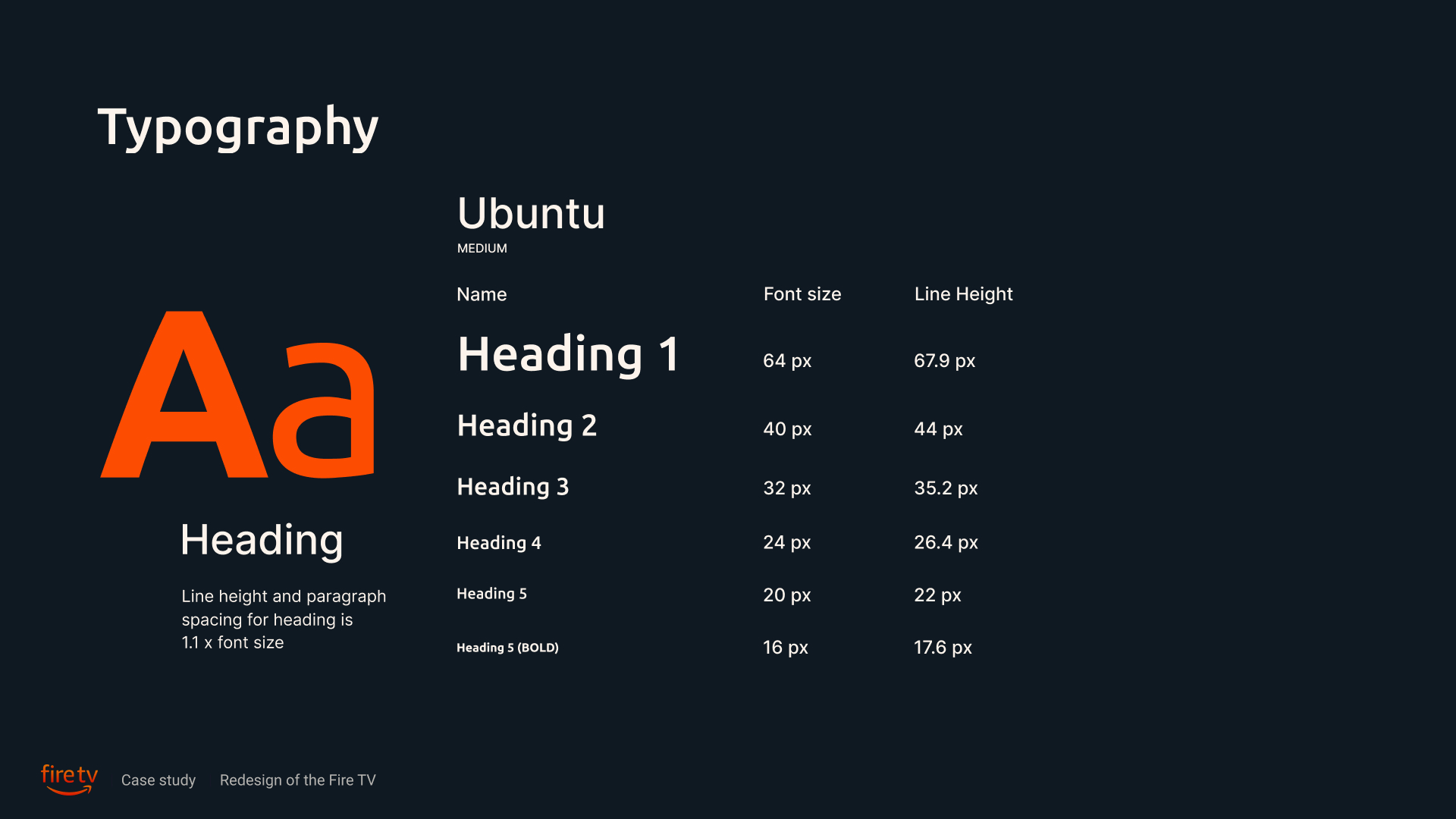
For typography we went for Ubuntu and Avenir. Ubuntu is chosen for titles due to its modern, open letterforms that ensure clarity and visibility. Avenir is selected for body text for its clean lines, balanced proportions, and excellent readability across digital media.

Design System
We also create a UI kit to make and reusing components. Below you can see some of the components I’ve created, such navigation menus, buttons, and icons.

High Fidelity Designs


Develop
And then we reached the grand finale. After styling our mid-fidelity screens, we embarked on constructing the polished high-fidelity prototype. Behold the culmination of our efforts:
