Type:
Mobile Design
Duration:
1 week
Team:
Sofía López
Tools:
Figma, Figjam
Summary:
The Papernest Club mobile design project aimed to create an application for tracking expenses and consumption while promoting Papernest services. The key features of the prototype included an expense statistics home screen, exclusive offers section, consumption insights section, news feed section, and real-time messaging section. The project involved competitive analysis, ideation, feature prioritization, user flow creation, low-fidelity sketches, usability testing, brand creation, high-fidelity design, and prototyping.
Project Context
A bit of context – For this project at Papernest, I collaborated with a colleague who requested a mock-up for an upcoming presentation to introduce a new project idea. Given my enthusiasm, I couldn’t stop at just a mock-up. Instead, I conducted a brief research and developed a quick prototype of the app my colleague had described.
Despite the tight deadline of just one week, I embraced the challenge and went beyond the initial request.
Project Overview
I didn’t knew much about the idea, so so my coworker told me a little more about this project. He wanted to create an application that tracks expenses and consumption, like a premium app for clients, while also promoting Papernest services. This was the first information I got from him.
After getting to know more about it, we refined our approach.
Our brainstorming sessions and user-centric focus led us to define the key features for the prototype:
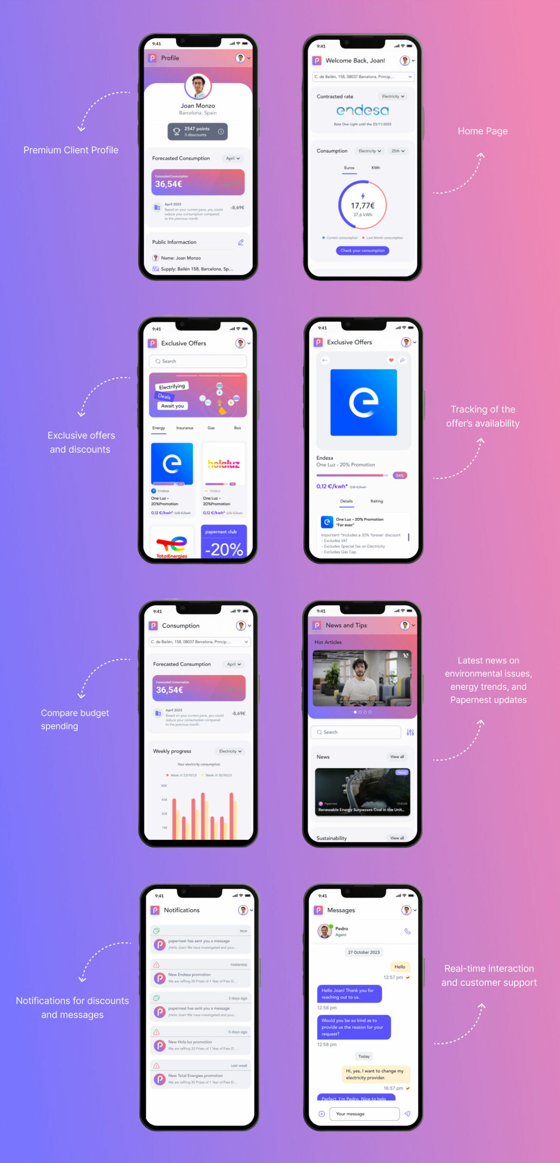
1. Home Screen: I made sure this screen showcases **expense statistics** clearly, with **information hierarchy** to help users easily compare their utility bills over the past months and weeks. It also includes important details like contract rates and overall consumption.
2. Exclusive Offers Section: Employing **persuasive design** and **user engagement strategies**, this section will display current offers and discounts on utility plans to encourage user interaction and retention.
3. Consumption Insights Section: Through **data-driven design** and **behavioral analytics**, this area will provide users with comprehensive statistical insights, helping them make informed decisions to optimize their spending and savings.
4. News Feed Section: Using **content strategy** and **dynamic content delivery**, this section will keep users updated with the latest news on environmental issues, energy trends, and Papernest updates.
5. Real-Time Messaging Section: Implementing **real-time interaction** and **user support frameworks**, this feature will facilitate seamless communication with customer support agents, offering immediate assistance and guidance on contract management and other inquiries.
In summary:
Papernest Club provides a comprehensive experience for managing and optimizing consumption and expenses, while also offering a direct connection to customer support to resolve any doubts or issues.
Creating Our Brand

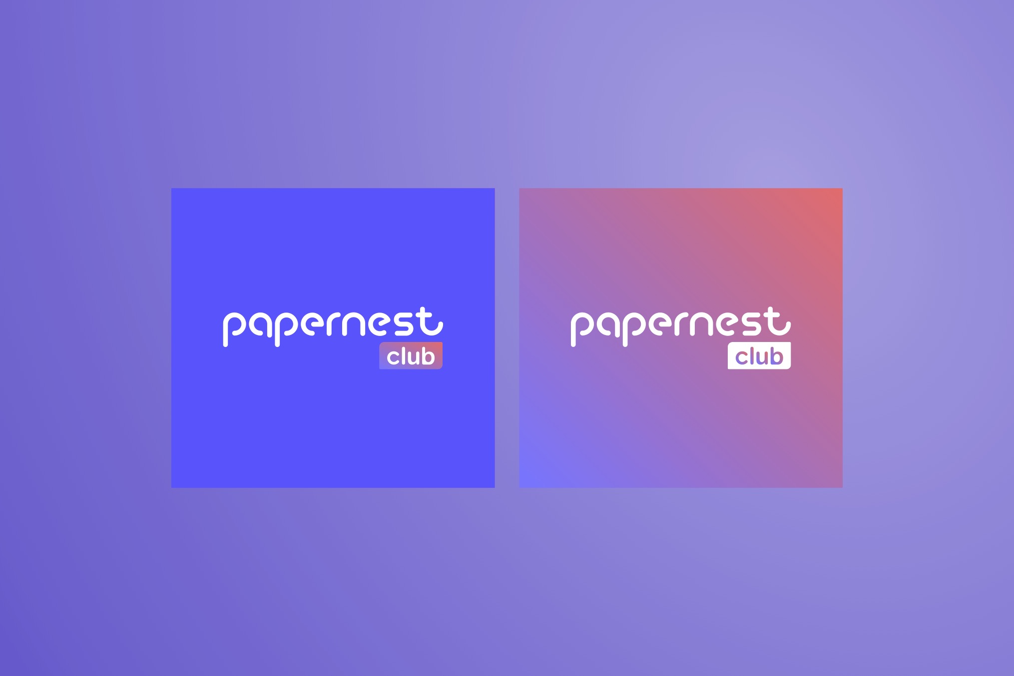
The logo creation process involved integrating Papernest’s original logo with the addition of the term “Club,” thus merging the two entities to form “Papernest Club.” This fusion was executed while maintaining visual coherence with the original brand identity. Additionally, a gradient was implemented, combining Papernest’s characteristic colors, aiming to provide visual dynamism and play with depth perception on the screen. Despite the youthful and innovative energy associated with Papernest, an approach that balances seriousness and elegance was maintained, ensuring continuity and cohesion with the brand’s essence.
High Fidelity
In the design, my main focus was to maintain a clean aesthetic, using light backgrounds that allow the information to stand out in a legible manner for the user. I highlighted two key accesses quickly and conveniently: on one hand, access to the user’s profile, where they can find their personal information and expenses; on the other hand, I included access to the main menu, from where users can access news, messages, and notifications.
To emphasize the buttons, I chose to use the same gradient as the logo to maintain a consistent and attractive design throughout the interface. This approach not only adds an appealing visual touch but also helps guide the user’s attention to the key interaction areas in the application.

Prototype
Play Video

